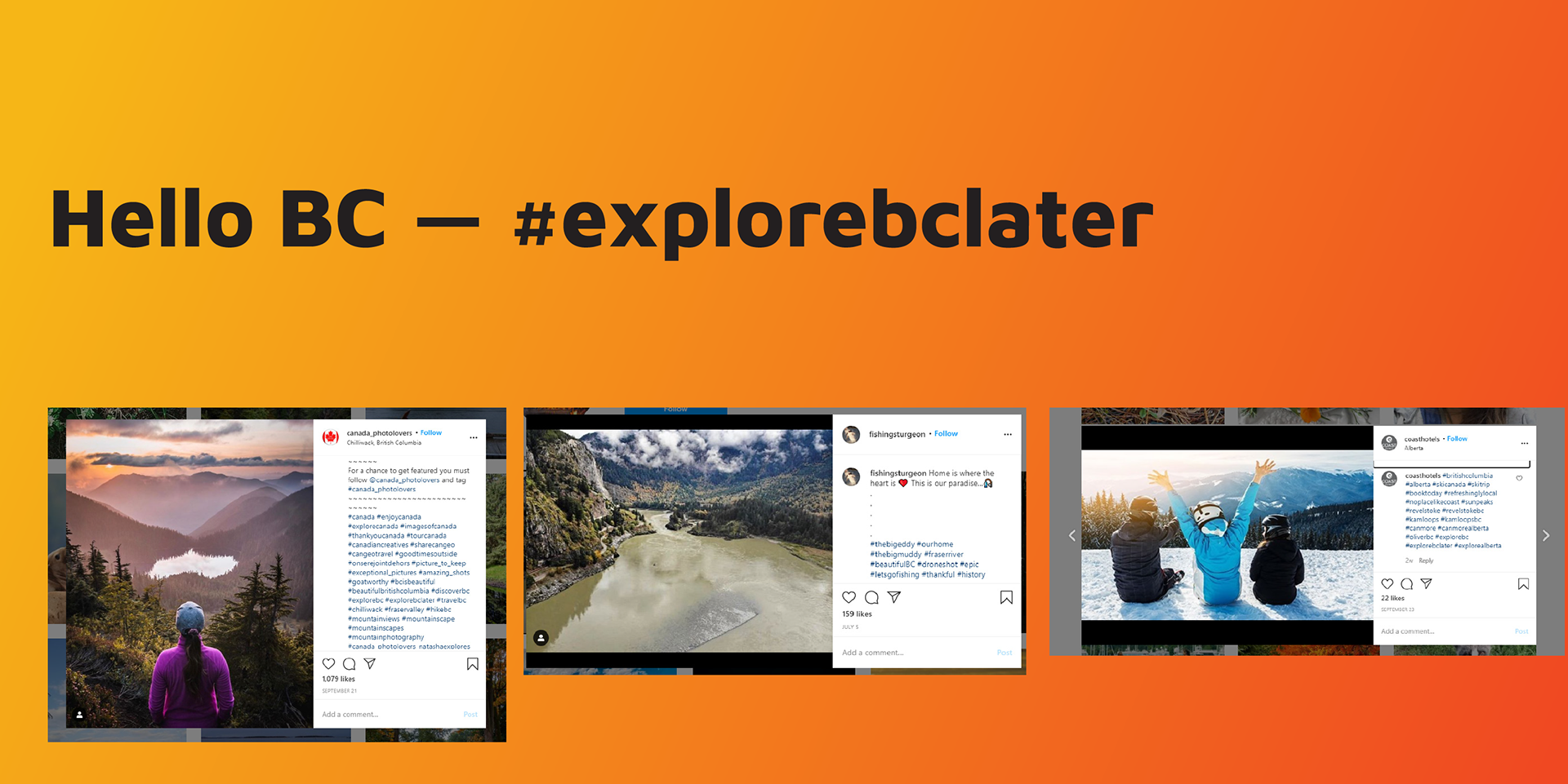
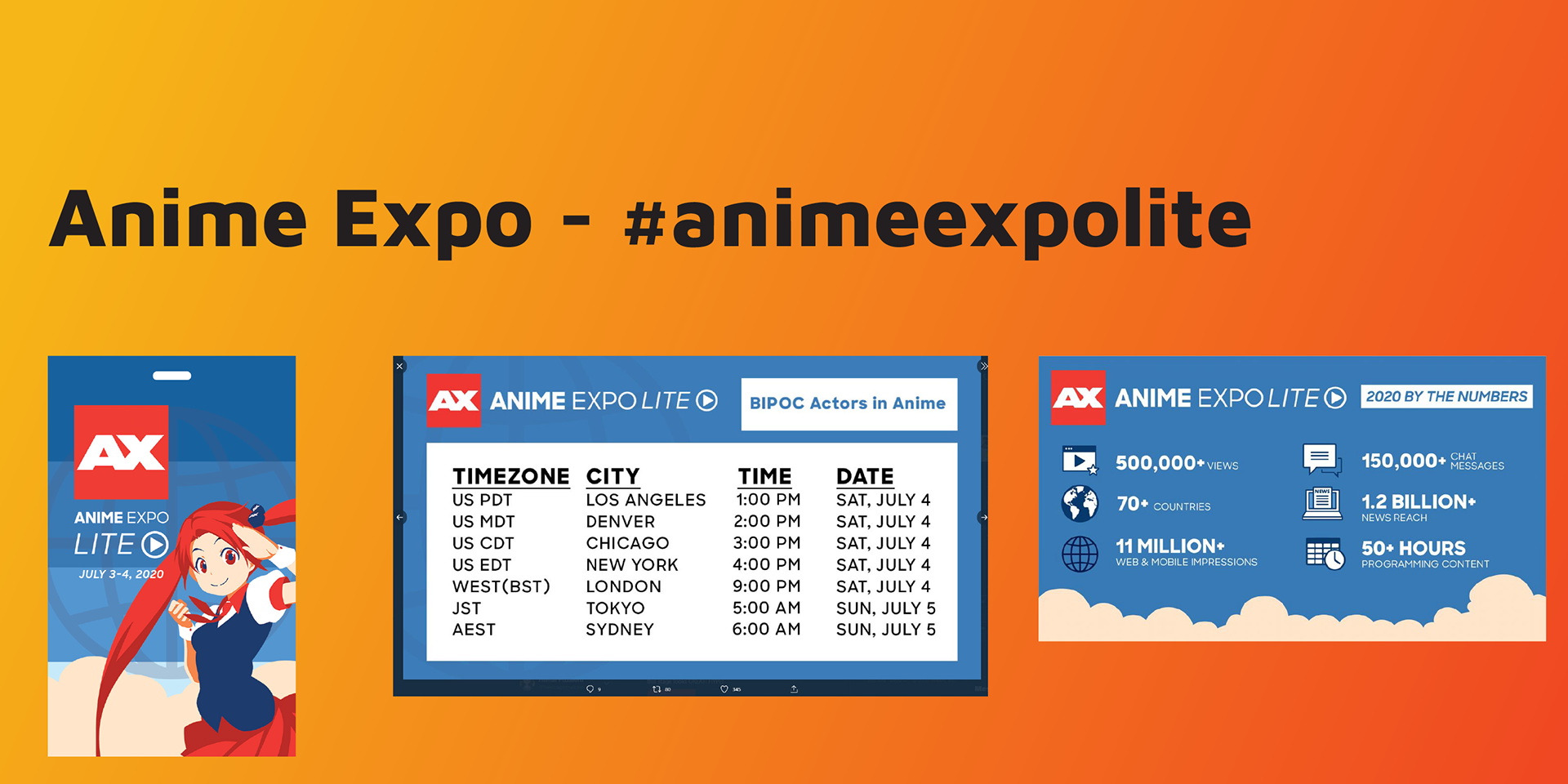
The goal of this study was to find ways to improve the user experience at Virtual Crunchyroll Expo. The project involved heavily researching similar events and finding ways to improve Crunchyroll’s. Most of the touchpoints are static though three are motion graphics created in After Effects.
This project was for educational purposes and is not associated with Crunchyroll.
Research
Promotion
The idea behind the promotion was to use irony to promote that Crunchyroll would be bringing the entire convention experience to a viewer's home. The hope is that people would be intrigued by the backwards marketing and become interested in the event.
Schedule Layout
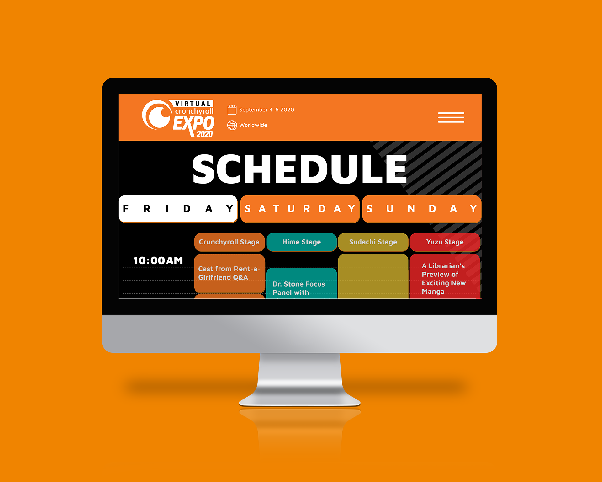
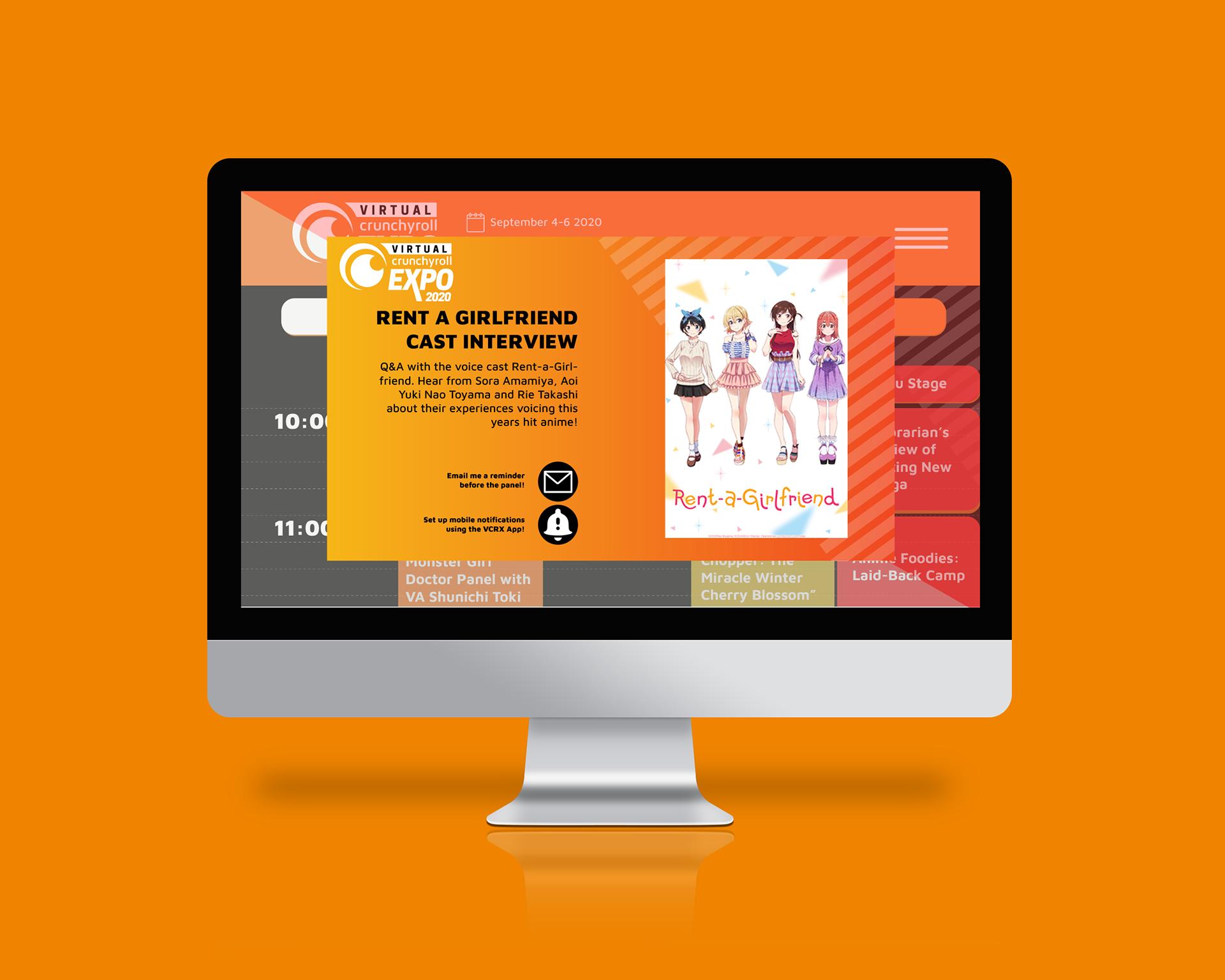
There were two main goals to the schedule layout. The first was to make it easier to find events. The seconds was allow attendees to receive notifications quickly from events they may be interested in. With push notifications and/or email, it would make sure attendees didn't miss the event and would also bring them back to the digital event.
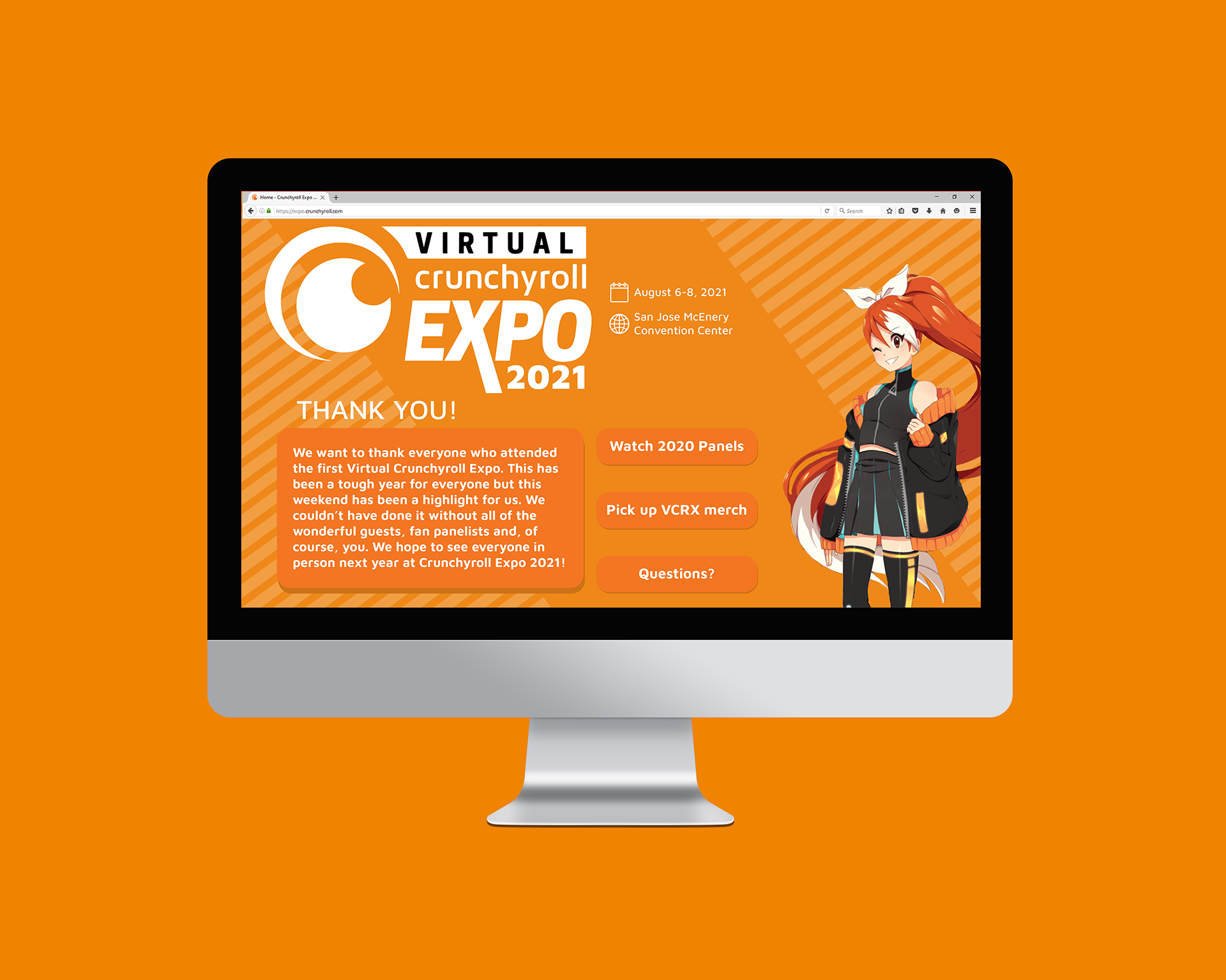
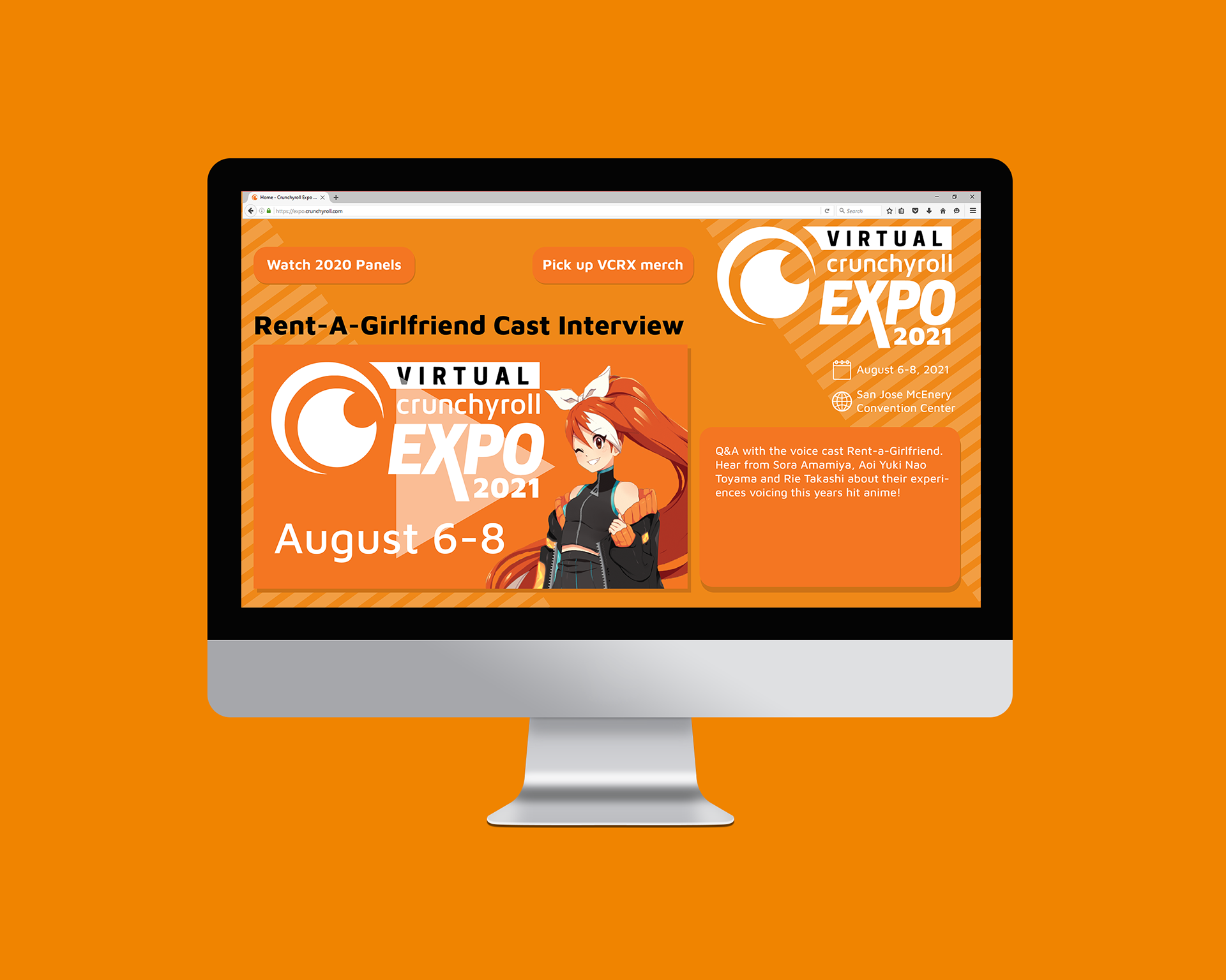
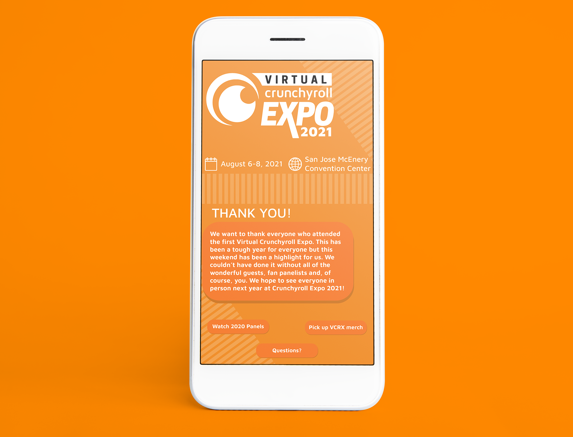
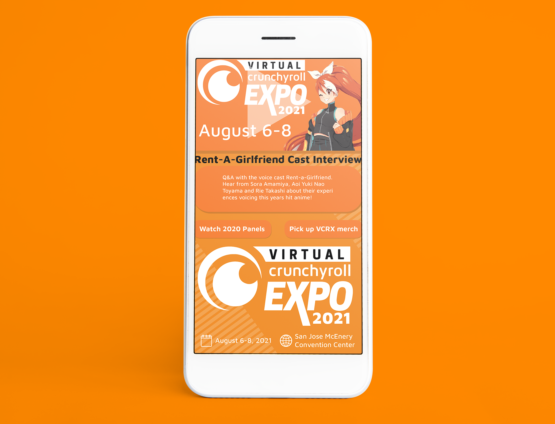
Follow-Up
The goal of the follow-up was to inform people about next year's event while also finding recorded videos from the event that just passed. Showing recordings from the previous event would help build interest in the next year's event.
